.jpg)
Get ready to discover the secrets that can transform your website into a conversion powerhouse. We're about to delve into the world of Conversion Rate Optimization (CRO) in e-commerce, and trust me, it's a game-changer.
Here’s what we’ll cover in this comprehensive guide on boosting CRO in e-commerce:
1. The Power of CRO in E-Commerce
Unlock the secrets of Conversion Rate Optimization (CRO) in e-commerce and learn how to transform casual visitors into enthusiastic customers.
2. Understanding the Impact of CRO in E-Commerce
Discover the power of creating customer personas and understanding your audience's desires to tailor your e-commerce strategies for maximum impact.
3. Unveiling Your Audience's Desires
Dive into the different stages of the conversion funnel—awareness, interest, consideration, and conversion—and learn how brands like Shopify and Zara optimize this journey.
4. The Conversion Funnel and Its Significance
Explore the role of design in CRO e-commerce, with examples from Apple and Sephora, and learn how to create a seamless and visually appealing user experience.
5. Crafting an Effective E-Commerce Design
Learn the art of creating persuasive product descriptions and using high-quality images to capture your customers' attention and drive conversions.
6. Overcoming Cart Abandonment Challenges
Tackle the challenge of cart abandonment head-on with tactics like personalized offers, cart abandonment emails, and retargeting, inspired by brands like ASOS and Adidas.
7. The Power of Social Proof and Trust Signals
Harness the magic of social proof and trust signals with real examples from Airbnb and Norton, and learn how to build trust and credibility with your customers.
8. Summary: Embrace CRO E-Commerce for Conversions and Growth
Wrap up your journey through CRO e-commerce with a call to action, urging readers to implement these strategies for improved conversions and business growth.
The Power of CRO in E-Commerce
Imagine this: you've got a bustling online store, but you're wondering how to level up your game. That's where CRO comes in. It's like giving your store a magical upgrade, where every little tweak you make has the potential to bring in more sales. I'm talking about those awesome moments when visitors turn into buyers, and your revenue graph starts looking like a mountain range.
Now, you might be thinking, "What's the big deal? Can small changes really make a difference?" Oh, absolutely. In the world of CRO e-commerce, even tiny adjustments can lead to some serious results. A better button placement, a more engaging description, or a smoother checkout process can all contribute to boosting your conversions and revenue.
In fact, did you know that for every $92 spent on driving traffic to websites, only $1 is spent on converting that traffic? Crazy, right? That's why we're here—to flip the script and make sure you're getting the most out of every visitor that lands on your digital doorstep.
So, picture me as your friendly guide on this journey. We're not diving into a sea of technical jargon and complex algorithms. Nope, we're taking a stroll through practical strategies, real-world examples, and insider insights that will make you feel like an e-commerce guru. Whether you're just starting out or looking to fine-tune your already successful store, the gems you'll find in this article will be worth their weight in gold.
Ready to take your e-commerce game to the next level? Let's get started and unravel the magic of CRO e-commerce!
Understanding the Impact of CRO in E-Commerce
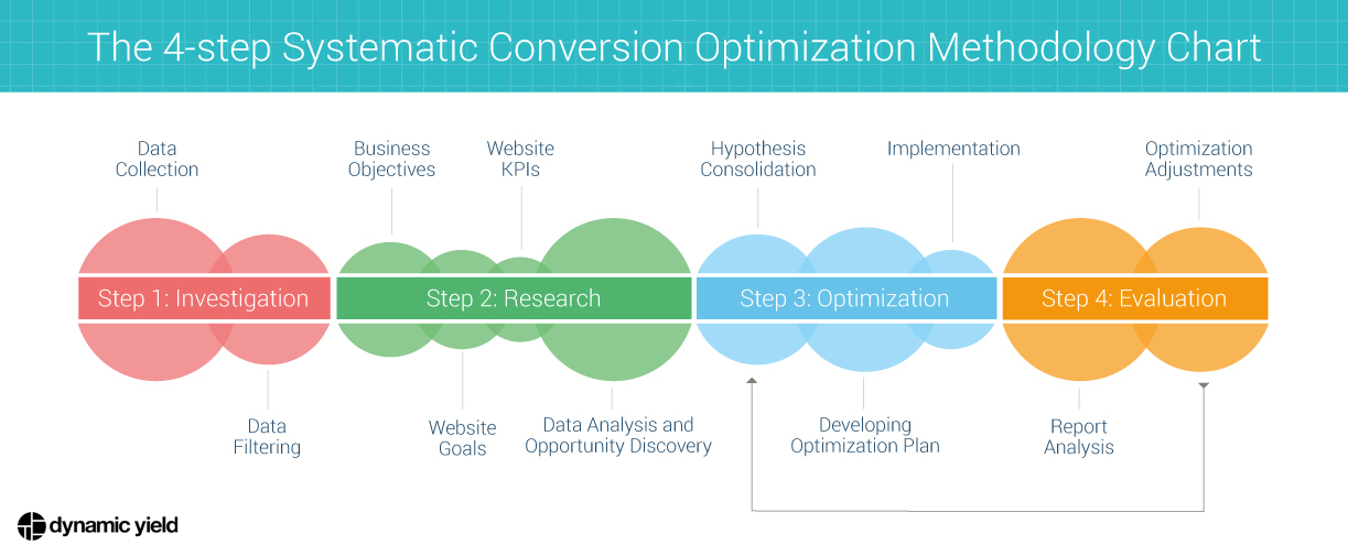
Alright, let's kick things off by cracking open the CRO e-commerce treasure chest. We're talking about Conversion Rate Optimization, the secret sauce that turns casual browsers into committed buyers. Why is it such a big deal? Well, let's dive in and find out.
Imagine this scenario: you're running an online store that's already getting a decent amount of traffic. But the question is, are those visitors turning into customers? That's where CRO enters the picture. It's like having a magical wizard on your side, making sure that each click on your website counts.
Here's a nugget of wisdom: improving your conversion rate by just 1% can result in a whopping 10% increase in revenue. That's the kind of math every e-commerce entrepreneur loves to see. It's not just about boosting sales—it's about maximizing the value of every single visitor who lands on your virtual doorstep.
Let's talk stats. Did you know that the average conversion rate for e-commerce websites hovers around 2% to 3%? Yup, you read that right. That means for every hundred visitors, only a handful end up becoming buyers. But here's where things get exciting. By fine-tuning your website, strategically tweaking elements, and implementing smart strategies, you can push that conversion rate higher and higher.
Now, you might be wondering, "Okay, but how do I do that?" Fear not, my friend. In this article, we're diving deep into strategies that real brands have used to master the art of CRO e-commerce. From crafting compelling product descriptions to nailing the perfect design, we're unpacking the tools and tactics that can make a serious impact on your bottom line.
So, whether you're a seasoned e-commerce pro or just dipping your toes into the online selling waters, get ready to arm yourself with actionable insights that will change the way you approach conversions. It's time to boost your CRO e-commerce game and watch your revenue soar like never before.
Unveiling Your Audience's Desires
Let's talk about the magic of knowing your audience like a pro. Think of it as understanding what makes your customers tick—their wants, needs, and secret desires. This is where CRO e-commerce truly comes alive.
Imagine this: you walk into a store, and the salesperson seems to know exactly what you're looking for. They recommend products that align perfectly with your style and preferences. That's the kind of experience you want to recreate in your online store, and it all starts with understanding your audience on a deep level.
Ever heard of customer personas? They're like character sketches of your ideal customers. Picture this: if you're selling athletic wear, you might have personas like "Yoga Yoda," "Fitness Fanatic," and "Casual Cruiser." These personas guide your decisions, helping you tailor your website, products, and messaging to resonate with each group.
Let's take a real example. Nike, the sports giant, knows its audience inside out. They've crafted personas that span from dedicated athletes to weekend warriors. By understanding these personas, Nike delivers personalized content and product recommendations that speak directly to each customer's preferences.
But hold on, we're not stopping there. Remember the power of the "Surprise and Delight" strategy? Check out Amazon—they're pros at it. Ever noticed how they recommend products based on your browsing history and previous purchases? That's the magic of using customer data to create a tailor-made experience that keeps visitors engaged.
Now, let's talk numbers. Did you know that companies using customer personas as part of their marketing strategy have seen a whopping 73% higher click-through rate? Yep, that's the power of understanding your audience's unique desires and crafting a message that speaks their language.
So, whether you're selling beauty products, electronics, or quirky collectibles, remember that CRO e-commerce starts with unlocking your audience's hearts. Dive into the minds of your customers, create those personas, and get ready to watch your conversions climb.
Here's a step-by-step guide on how to unveil your audience's specific desires:
1. Identify Your Target Audience:
Start by defining your primary audience. Consider demographics, online behavior, and purchasing habits.
2. Conduct Surveys and Polls:
Use tools like SurveyMonkey or Google Forms. Ask questions about product preferences, shopping habits, and pain points.
3. Analyze Customer Reviews:
Study reviews on your website and competitor sites. Identify common praises or complaints.
4. Engage on Social Media:
Monitor comments, mentions, and direct messages. Use polls on platforms like Instagram or Twitter to gather feedback.
5. Study Website Analytics:
Use Google Analytics to track user behavior. Identify high-performing pages and drop-off points.
6. Create Customer Personas:
Based on your findings, craft detailed customer personas. Include preferences, challenges, and motivations.
7. Test and Iterate:
Implement changes based on insights and continuously gather feedback and refine your understanding.
By following these steps, you'll gain a deeper understanding of your audience's desires, allowing you to tailor your e-commerce strategies for maximum impact.
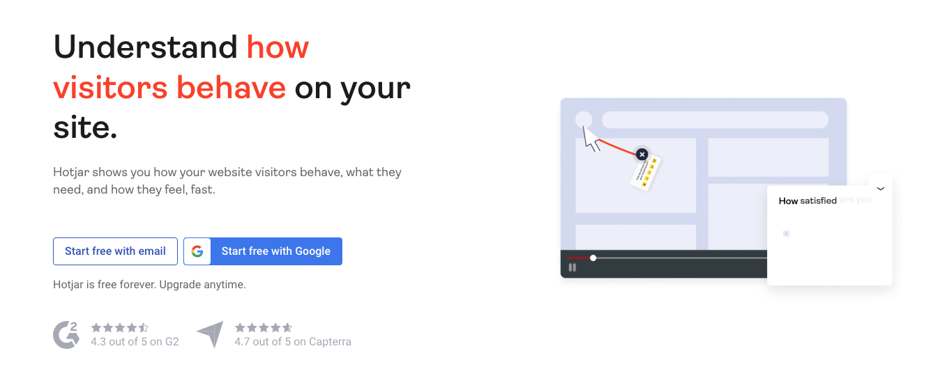
Powerful software tools for understanding your audience:
- Google Analytics: This classic tool helps you analyze user behavior on your website, revealing insights about your audience's interests, demographics, and browsing patterns.
- Facebook Audience Insights: If you're looking to target your audience through social media, this tool provides valuable data on user demographics, interests, and online behaviors
- Hotjar: With heatmaps, session recordings, and user surveys, Hotjar gives you a visual understanding of how visitors interact with your site, helping you uncover pain points and opportunities.
The Conversion Funnel and Its Significance
Alright, let's talk about the "Conversion Funnel"—your map to turning curious clickers into enthusiastic buyers. Think of it as the journey your customers take, from the moment they land on your site to the glorious "Add to Cart" and beyond. CRO e-commerce is all about understanding this journey and optimizing it for ultimate success.
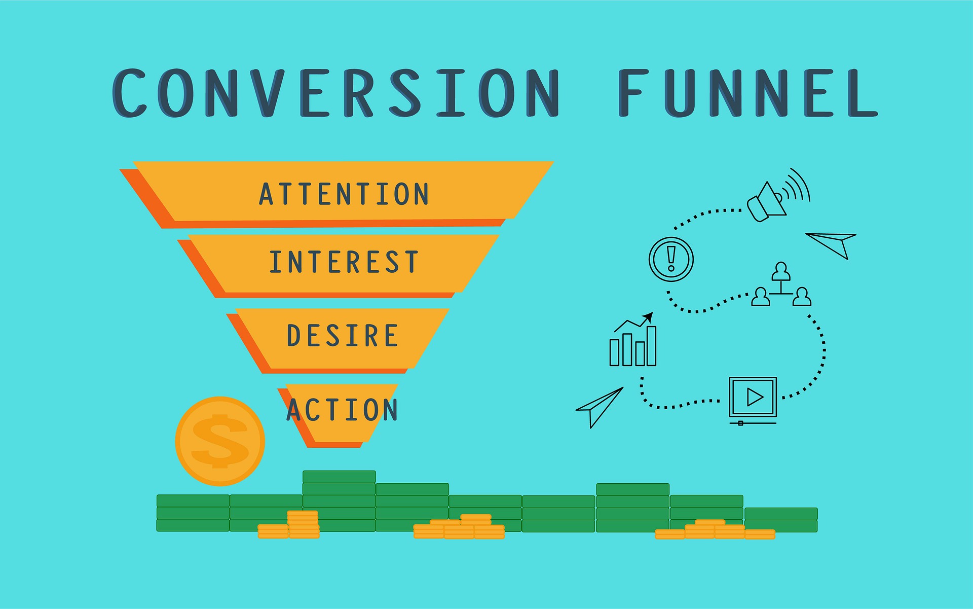
Picture this: you're hosting a grand event, and you want every guest to have an amazing time. The Conversion Funnel is like planning that event, ensuring each step is seamless and enjoyable for your visitors. There are different stages: awareness, interest, consideration, and finally, the glorious conversion.
Let's talk about the first stage: Awareness This is when your potential customers discover your brand. Take Dollar Shave Club as an example. Their viral video campaign reached millions, skyrocketing their brand awareness and filling the top of their funnel.
Moving along, we have the Interest stage. Now that visitors know about you, they're interested in what you offer. Zappos nailed this by showcasing their wide range of shoes and offering free shipping and returns, making the interest-to-consideration transition seamless.
Next up, it's the Consideration stage. This is when your visitors are evaluating their options. Amazon shines here with their product reviews and ratings, providing social proof that helps customers make informed decisions.
READ: How to shorten your customer shopping journey
Amazon has done extensive research understanding their own customer's journey.
One of the paramount examples of mastering the customer journey in the e-commerce realm is Amazon. As a global e-commerce titan, Amazon has meticulously optimized its platform to cater to every nuance of a customer's online shopping experience.
1. Personalized Recommendations: Right from the moment a user logs in, Amazon's homepage presents a curated list of product recommendations. These are not random; they're based on the user's browsing history, past purchases, and items in their wish list. This personalized touch ensures that users are immediately presented with products that resonate with their preferences, nudging them closer to a purchase.
2. Customer Reviews: Amazon understands the power of peer opinion. Each product page is replete with customer reviews, ratings, and Q&A sections. These reviews serve a dual purpose: they provide genuine feedback about the product and act as a form of social proof. For a potential buyer who's on the fence, a slew of positive reviews can be the gentle push they need to add the product to their cart.
3. Seamless Checkout Process: Amazon's checkout process is a masterclass in user experience. With features like "1-Click Ordering," users can bypass the traditional cart system and make instant purchases. For those who prefer a more standard approach, the cart system is intuitive, with clear prompts for address and payment details. Amazon also offers multiple shipping options, catering to the urgency of the user's need.
In essence, Amazon's strategy revolves around understanding and anticipating user needs at every stage of the shopping journey. By offering personalized touches, fostering trust through customer reviews, and ensuring a hassle-free checkout process, Amazon effectively guides its users from mere browsers to loyal customers.
Finally, the moment we've all been waiting for: Conversion
This is when your visitors turn into customers by making a purchase. And when it comes to CRO e-commerce, every little detail counts. Etsy is a prime example—by using high-quality images and detailed descriptions, they create an irresistible buying experience.
But hold on, we're not done yet! Let's not forget about the Post-Purchase Experience Birchbox nails this by sending follow-up emails with tips on how to use their beauty products, ensuring that customers stay engaged even after the conversion.
Here are a couple of gems that can help you understand and optimize your Conversion Funnel:
- Kissmetrics This tool tracks user behavior across various stages of the funnel, helping you pinpoint where visitors drop off and where they convert.
- Crazy Egg: With heatmaps and scroll maps, Crazy Egg visualizes how users interact with your site, showing you what's working and what needs improvement.
Remember that CRO e-commerce is all about mastering the Conversion Funnel. By understanding each stage and optimizing the journey, you're well on your way to transforming your visitors into raving fans and loyal customers.

Crafting an Effective E-Commerce Design
In online shopping, visual design is the magic that can turn casual browsers into dedicated buyers. Think of your website as a canvas, and your design choices as the brushstrokes that guide your visitors toward that sweet "Add to Cart" button. Welcome to the realm of CRO e-commerce design.
First things first, clear navigation is your knight in shining armor. Take a page from Zara's book—their website is a masterclass in simplicity, making it easy for visitors to find what they're looking for without feeling lost in a digital labyrinth.
Speaking of design, let's talk CTAs (Call to Actions). These are the signposts that direct your visitors toward the actions you want them to take. Warby Parker (again) nails this—every CTA is strategically placed, guiding users smoothly through their journey, whether it's trying on frames or making a purchase.
And let's not forget about the mobile experience. Sephora sets a gold standard with their mobile site, ensuring a seamless shopping experience on any device. With mobile sales accounting for a significant chunk of e-commerce revenue, a responsive design is your ticket to CRO e-commerce success.
Did you know that 38% of visitors will stop engaging with a website if the layout is unattractive? That's the importance of a visually appealing design. And when 73% of mobile users say they've encountered a site that was too slow to load, you can see why optimizing your design for speed is crucial.
A/B testing your design variations is like having a crystal ball into your visitors' preferences. Here are a some tools that can help you A/B test and improve your website’s design:
- Optimizely: an experimentation platform that allows you to conduct A/B tests and optimize various elements of your website to enhance user experience and conversions.
- Unbounce: a landing page builder that empowers you to create custom landing pages optimized for conversions, making it easier to drive targeted campaigns and boost your CRO e-commerce efforts.
Remember that design isn't just about aesthetics—it's about guiding your visitors toward the ultimate conversion. By taking cues from design masters like Zara, Warby Parker, and Sephora, you're casting a visual spell that will keep your visitors engaged and your conversion rates soaring.
Captivating with Compelling Product Descriptions and Imagery
Let’s explore how persuasive product descriptions and alluring imagery can work wonders for your CRO e-commerce game.
Imagine this: you stumble upon a product online, and its description makes you feel like you're already using it. That's the magic of a well-crafted product description. Take Apple for instance—they're pros at painting a vivid picture of their products, making you feel like you're holding them in your hands.
But wait, we're not stopping at words. Let's talk imagery. High-quality images that showcase your products from various angles can be the difference between a scroll and a sale. Casper, the mattress company, knows this game well. Their website is a visual delight, letting you zoom in, explore, and even imagine yourself dozing off on their comfortable mattresses.
Get this, product images with reviews generate an average conversion rate 58% higher than those without. That's the power of combining visuals with real customer opinions, turning curiosity into confidence.
And here's a little secret weapon: video Product videos can increase purchases by 144%! TOMS Shoes nailed this by using videos that not only showcase their products but also share the heartwarming story behind each purchase.
Here are a some tools that can help you level up your product descriptions and images:
- Canva: it's like having a graphic design genie at your service, helping you create captivating visuals even if you're not a design whiz.
- Animoto: is your go-to, enabling you to craft engaging videos that tell your brand's story.

So remember that CRO e-commerce isn't just about products—it's about the stories you tell through descriptions and visuals. By taking cues from Apple, Casper, and TOMS Shoes, you're crafting an experience that leaves your customers utterly enchanted.
Overcoming Cart Abandonment Challenges
Time to tackle a challenge that plagues every online store: cart abandonment. Picture this—you've got customers excited about your products, they've added items to their carts, and then... poof! They vanish. But fear not, because CRO e-commerce has some nifty tricks up its sleeve to rescue those abandoned carts.
So, why do carts get abandoned? Sometimes it's unexpected shipping costs, sometimes it's a lengthy checkout process. But here's the deal, according to Gitnux, 58.6% of online shoppers abandon their carts due to extra costs like shipping, taxes, and fees. That's a huge chunk of potential revenue down the drain.
Now, let's talk tactics. Ever received an email from a store nudging you about the items left in your cart? That's the magic of cart abandonment emails. Brands like Rebecca Minkoff use these emails to gently remind customers about their abandoned items and even offer a little incentive to seal the deal.
And how about personalized offers? Imagine adding an item to your cart and receiving a discount on it within hours. That's what ASOS does—they offer personalized discounts based on your browsing behavior, giving you a nudge to complete the purchase.
But the cherry on top is retargeting ads. Adidas mastered this by showing products from abandoned carts in ads across the web, reminding potential customers about the items they left behind. Connecting shoppers to your happy customers is another great way to convert abandoned shoppers. You can use a platform like Moast for this.
Here are some helpful tools to convert cart abandoners:
- Rejoiner: is your ally for crafting compelling cart abandonment emails that bring those lost customers back.
- AdRoll: helps you create and manage ads that keep your brand in front of potential buyers.
- Moast: connects your undecided shoppers with your happy customers for virtual or in-person meetups.
Don't let those abandoned carts haunt you. Embrace CRO e-commerce strategies to turn those almost-purchases into successful conversions.

The Power of Social Proof and Trust Signals
Ever wonder why customer reviews and testimonials have such a profound impact on our buying decisions? It's all about social proof—our tendency to trust the choices of others. Let’s unravel how harnessing social proof and trust signals can work wonders for your CRO e-commerce strategy.
Imagine this: you're browsing a product, and right below it, you see reviews from people who've already bought it. Instantly, you feel a sense of trust, like you're getting insider information. That's the power of social proof. Brands like Airbnb leverage this by showcasing guest reviews and ratings, helping travelers feel confident about their bookings.
Now, let's talk about another trust signal: trust badges. These little icons convey security and reliability, making customers more comfortable sharing their payment information. Take Norton Secured badges, for instance. Websites that display these badges experience a 42% increase in conversions—that's a boost you can't afford to ignore.
But here's the magic touch—real-world proof. Imagine seeing a map with glowing pins indicating happy customers who've had positive experiences. Brands like Oru, who use Moast, bring social proof and trust to life by showing real locations of delighted customers on a map. This not only adds authenticity but also makes potential buyers feel like they're part of a trusted community.
And speaking of trust, let's not forget about user-generated content. Brands like GoPro encourage their customers to share their action-packed adventures using their products. This not only builds a community of enthusiasts but also provides authentic content that resonates with potential buyers.
Now, let's dive into some tools to amplify the power of social proof and trust signals:
- Yotpo: This tool helps you collect and showcase customer reviews and ratings, turning them into compelling social proof for your products.
- TrustPulse With real-time social proof notifications, TrustPulse lets your visitors know when someone makes a purchase or takes an action on your site, creating a sense of urgency and credibility.
CRO in e-commerce isn't just about products—it's about building trust with your customers. By tapping into the magic of social proof and trust signals, you're creating an environment where visitors turn into loyal customers and raving fans.

Harnessing A/B Testing for Continuous Improvement
Let’s delve into a realm of optimization magic that can take your CRO e-commerce efforts to the next level: A/B testing. Think of it as experimenting with different versions of your website to see what resonates best with your audience. Get ready to uncover how this wizardry can lead to continuous improvements and higher conversions.
Imagine this: you've got a website element that could use a little sprucing up, be it your CTA button color, your headline, or even your product images. A/B testing lets you create two variations—the original (A) and a tweaked version (B). Then, you let your audience decide which one performs better.
Let's look at a real example: Booking.com They tested their call to action button color, changing it from green to red. The result? A whopping 17% increase in conversions. That's the power of A/B testing.
Now, let's talk about strategies. Let's say you're a fashion retailer and you want to test your product page layout. You could use tools like Convert or VWO to set up these tests. One variation might have the product image on the left, while the other has it on the right. Through these tests, you'll learn what your audience prefers, helping you make data-driven design decisions.
And here's a fascinating stat: businesses that implement A/B testing are twice as likely to see conversion rate improvements of 2% or more. That's a double dose of awesomeness for your bottom line.
But hold on, don't stop there. The beauty of A/B testing lies in its iterative nature. Keep testing, tweaking, and refining to uncover even better versions of your website that resonate with your audience.
CRO in e-commerce isn't just about your initial design—it's about a journey of continuous improvement. By taking cues from Booking.com and embracing the wonders of A/B testing, you're setting yourself up for a future filled with better conversions and happier customers.
Summary: Mastering CRO E-Commerce for Explosive Conversions
Congratulations, you've embarked on a journey through the comprehensive realm of Conversion Rate Optimization (CRO) in e-commerce. Along the way, we've unveiled the importance of understanding your audience, optimizing the conversion funnel, crafting compelling designs, and harnessing the power of social proof and trust signals.
Remember, CRO e-commerce isn't just a collection of strategies—it's a mindset, a commitment to understanding your customers and tailoring their experience to drive conversions. As you delve into the art of creating customer personas, optimizing your website's design, and employing trust-building techniques, you're wielding the tools to transform browsers into buyers.
But here's the real magic: it's time to put these strategies into action. Embrace the power of data-driven decision-making by diving into tools like Google Analytics and Optimizely. Experiment, tweak, and iterate based on insights to witness firsthand the impact on your conversions.
As you implement these strategies, imagine a world where your visitors aren't just passing by, but actively engaging with your brand, adding products to their carts, and completing purchases. It's a world where abandoned carts become success stories, where your website's design becomes a captivating canvas, and where every decision is guided by the wisdom of analytics.
So, my friends, seize this moment to embark on your own e-commerce adventure armed with CRO knowledge. It's a journey that promises not just improved conversions, but also business growth, brand loyalty, and a community of satisfied customers.
Related content
Turn your social content into a revenue channel
Turn your TikToks and Reels into shoppable videos and boost conversions by 3.5x.

